


The (Many) Covers of The Dispossessed
A book designer guides us through the design,history of Le Guin's masterpiece


A note from Jared: When we started our read-along of The Dispossessed, I noticed a wide variety of covers in its publication history. I asked
to write a post about it. Enjoy.
I don’t have the data to back this up, but it seems there is no type of book that generates more covers for a single title than the twentieth-century science fiction novel. The Dispossessed by Ursula K. Le Guin is no exception.
A quick image search for the 1974 novel surfaces no less than a dozen different covers—in just the first two rows of results! Why? I think the reasons are threefold:
Science fiction, especially mid-century science fiction (being a little generous with this term here) was often repackaged into several cheap, portable mass market versions. The sort you find today at the used bookstore whose spine you are afraid to crack for fear of pages falling out.
50 years is a long time! If a book is still in print after 50 years, it is inevitably going to get new versions that align with the tastes of the times (and the country in which those tastes reside).
If a book is more than relevant, but seen as important after 50 years, that thing is getting an anniversary edition.
Today, as a companion to this Commonplace Philosophy read-along, I’d like to discuss several of these covers beginning with the 1974 first edition.
1974 U.S. First Edition

Alright. If I may be honest here, this is not what I was expecting. While my wife is a fan of Le Guin’s, I am a relative newcomer to her work, and before Jared asked if I would write this guest post, I had never seen the original cover of this novel.
At first blush, this cover almost reads as fantasy. This, I think, is due to the dress of the figure that dominates the frame, and the dominant earthy color palette. I am not a clothing expert by any stretch of the imagination, but the man reads as being part of the Renaissance or something of the sort. There are clearly science fiction elements here, but they are not the first thing the eye sees.
While twentieth-century science fiction is no stranger to illustrated covers like this, I also wonder if these earthy, golden, monochromatic tones have anything to do with my “fantasy” reading.
The type, on the other hand, makes perfect sense to me as a 1970s science fiction novel. Science fiction and modernist sans serifs have long gone hand in hand.

As you can see above, the illustration wraps around the spine and on to the back of the jacket.
1974 UK First Edition

Let’s now cross the pond and look at the 1974 U.K. first edition. Could there be a more different looking book? The disparity between these jackets is one of the things I love most about book design—but it can also be one of the more frustrating aspects from the perspective of a reader.
What’s this book about? No idea, but it will catch your attention with its colorful, stylized type on a stark field of black. This cover is so different, and so light on story details, I wonder if it was a direct response to the American cover.
1976 Panther Science Fiction

At last, here is the pulpy sci-fi look I was expecting! Panther Science Fiction was a British publishing house especially active in the mid-twentieth century.
Chunky, slab-serif type that cares more about the author name than the book title. Several supplementary lines of type selling the book in a small, workhorse sans serif. A color palette that will make Fanta-lovers drool and an illustration that screams “THIS IS ABOUT SPACE.”
I’m not sure how much this illustration reveals about plot—it’s missing the two spherical planets depicted in several of the later editions1—but it tells me that A) it’s by Le Guin, B) it’s in space, and C) it’s got a hero doing the Luke Skywalker sunset pose a whole year before Star Wars was released.
1985 Avon Books

Here, finally, we see a clear visualization of two planets. While the former cover showed the perspective from one planet, here we clearly see the two very different spheres that occupy the story.
The type here is stylized and energetic, with pointy serifs that almost remind me of the 1974 UK edition. The swirls emanating from the planets almost read as speed marks behind a title as if it swooped in like Superman: The Movie.
Knowing the philosophical nature of Le Guin’s work—hence the read-a-long on this newsletter—this cover may read as too pulpy or adventurey.
I think the same can be said for another Avon edition of the book, seen here:

Harper Perennial Classics, 2014

Jumping forward in time, here is the cover that prompted Jared to ask me—I’m paraphrasing a bit here—“why do I hate this?”
This cover from Harper Perennial was published in 2014. Before looking up this edition’s publication date, I could have sworn to you it came out in, like, 2005. Its visual language reminds me of the aughts. With the advent of desktop publishing software and Adobe Photoshop in the ’90s, both non-fiction and fiction covers began to see photography more often as key art (and wacky typography, but that’s a different story). Why? The same reason for the widespread adoption of any new technology: it was cheaper and more efficient. We’ve since rebounded from these trends, and now photography is just one tool in the kit for cover design. This was also the case in 2014, so there were a lot of approaches available for this cover. I wish I could have been in the room when this cover was being discussed, or even better, see some of the unused comps. This cover smells like corporate homogeny and risk-aversion. I would bet there were more exciting options presented.
There’s nothing wrong with this cover necessarily. It’s perfectly competent and well-executed by a clear professional. It’s just boring. It’s boring, right? Sterile landscapes that could be Windows screensavers, a standard, condensed sans-serif, and symmetry to a fault.
Harper Perennial Olive Editions, 2015

An interesting point of comparison to the last cover is this one, published in 2015. Like 1974’s dueling covers, could there be more different covers released so closely in time? While the last cover was completely photorealistic, this one is completely illustrative, textured, and minimalistic. They get at similar ideas—one lush, green planet, one harsh, desert planet—with completely different approaches.
An important note to make about this cover is that it is part of Harper Perennial’s Olive Editions series, meaning it is not a standalone cover and is visually related to the other titles in this series released in 2015.

50th Anniversary Edition, 2024
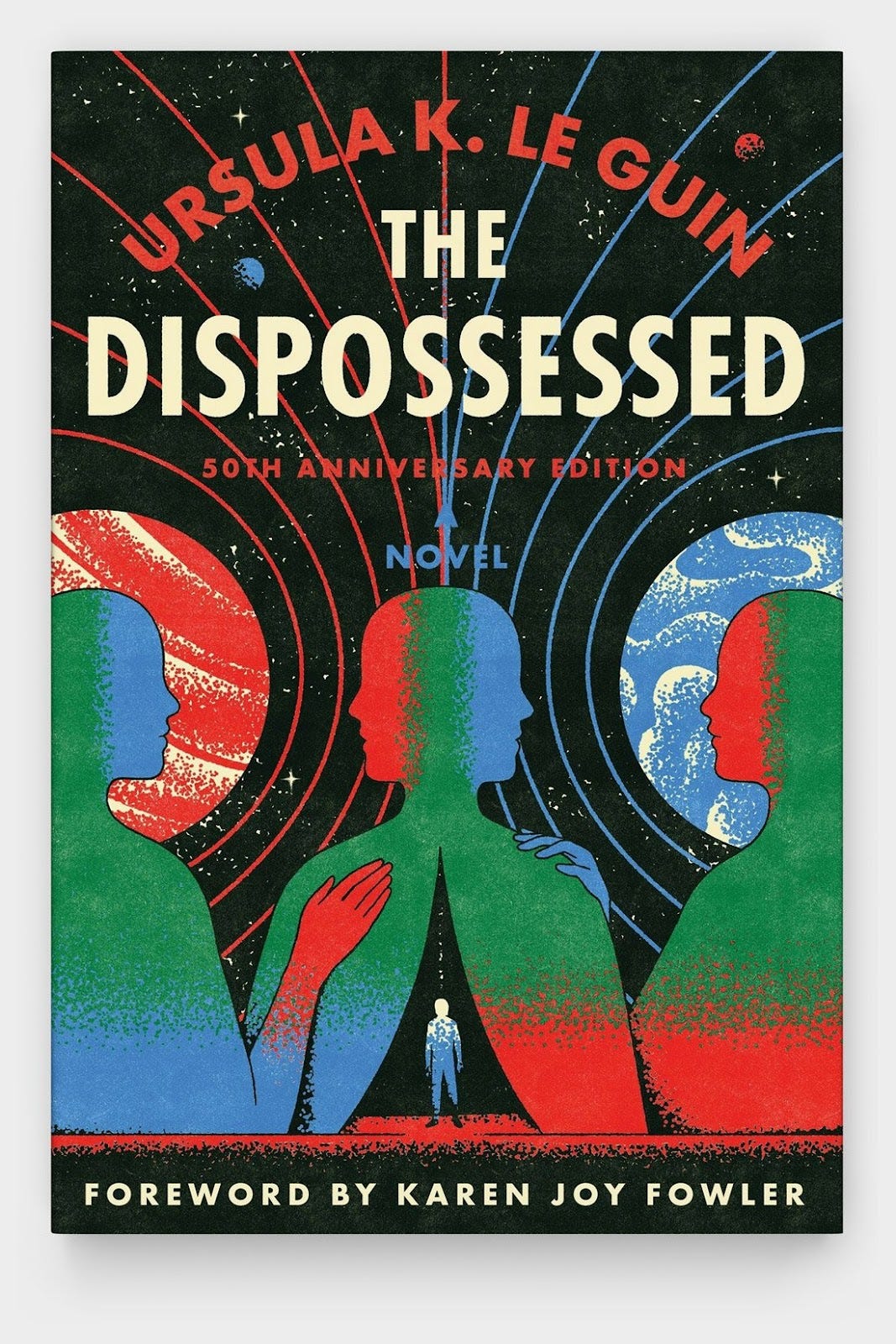
Finally, we end with the 50th Anniversary Edition, published in 2024. Perhaps it is recency bias, but this is my favorite version. Ironically, this latest version looks old, approximating a vintage, mid-century aesthetic. Appropriate, I think, for a cover celebrating 50 years of a book’s existence. We come full circle; what’s old is new again.
This cover is a terrific combination of several design sensibilities seen thus far—it is bold, colorful, and clearly a “space” book like some of the earlier editions, while also symmetrical, balanced, textured, and philosophical like later versions. There is a lot going on here, but it all feels very considered and balanced. I love the stippled gradient work, and of course, Futura, my favorite typeface—the one that’s on the moon.
I am drawn to—and a little disturbed by, to be honest—the figures at the bottom. Maybe it’s because these faceless figures remind me of something like a combination of The Blue Man Group and the alien at the end of Annihilation (you never know what associations your brain might make). I think including figures here speaks to the human conflict between these two planets that I don’t feel from the covers that just depict worlds. The two-headed figure in the center alludes to a choice that needs to be made.
Honorable Mentions
Believe it or not, there are more covers for The Dispossessed I didn’t mention. Here are a few more I found:


Thanks for reading
Thanks for reading! Tell me—what cover adorns the copy of The Dispossessed you read? Which is your favorite, and which do you think best represents the book? Are they the same?
Nathaniel Roy is a book designer, collage maker, photo taker, and a few other things in Ypsilanti, Michigan. He writes A Book Designer’s Notebook, a newsletter about book design and creative practice for writers, designers, and book lovers.
I realize the figure is standing on one of the planets, but that isn’t immediately apparent
 | A guest post by
|
Thanks. This was fun to see the history of the covers.
I ran into this minefield of covers and trying to find a used copy. Ironically I ended up with the most recent because others had really poor condition assessments. Probably an indicator of a well read book.
I'm quite into the swooshy 1985 title-in-space one with Anarres top left and Urras bottom right: it's a dynamic composition, it catches some of the in-between-planets-ness of the plot, and I dig the font. I see why you like the 2024 one but to my eye it has a bit of a hipster vibe, ironically retro